Browsed by
Author: Liv Mogstad Strickert

Inktrapment: Diamine Inkvent 2023 no. 6

Inktrapment: Diamine Inkvent 2023 no. 6

Two chameleon inks in a row! Under door number six, we find Buck’s Fizz, a very light orange ink with gold-green shimmer. In wet areas, it looks quite sunny and sparkly, with some shading and a slightly darker halo. In writing it unfortunately becomes too pale and subdued — and it seems painfully dry. Liv Mogstad Strickert is a regular contributor to Pennen er mektigere and will be posting daily ink reviews of Diamine’s Inkvent 2023 in December.

Inktrapment: Diamine Inkvent 2023 no. 5

Inktrapment: Diamine Inkvent 2023 no. 5

Behind door number five, we find the night sky adorned with the Northern Lights. Nightfall is a very dark blue, chameleon ink, with blue-green shimmer and a touch of copper or red sheen in wet areas. It appears almost black on paper, and there is little to no shading to be seen. The ink seems very wet, and the shimmer flows quite well. Nightfall also strongly reminds me of another Inkvent ink, namely Stargazer from 2021—except Stargazer has a slightly…

Read More Read More

Inktrapment: Diamine Inkvent 2023 no. 4

Inktrapment: Diamine Inkvent 2023 no. 4

On the 4th of December, we get the 3rd ink series in this year’s Inkvent, namely shimmer — that is, the “regular” shimmering ink from Diamine. Masquerade is a brownish purple or a brownish pink ink with gold shimmer, some shading, and a dark halo in wet areas. The ink resemblances Robert Oster Rose Gold Antiqua quite a bit, but is slightly darker and has a browner tone. Here is Masquerade between two Robert Oster inks: Rose Gilt Tynte (lighter…

Read More Read More

Inktrapment: Diamine Inkvent 2023 no. 3

Inktrapment: Diamine Inkvent 2023 no. 3

Behind door number 3, we find another standard ink. Early Dusk is a medium dark blue with some shading and a dark, blue-black halo. In wet areas, there is some red sheen – and perhaps a hint of purple undertones? The ink seems to be on the dry side. It’s a nice color, but not very unique. Liv Mogstad Strickert is a regular contributor to Pennen er mektigere and will be posting daily ink reviews of Diamine’s Inkvent 2023 in…

Read More Read More

Inktrapment: Diamine Inkvent 2023 no. 2

Inktrapment: Diamine Inkvent 2023 no. 2

The second ink in this year’s Inkvent is from the standard series. Standard inks have neither shimmer nor other “special” characteristics such as scent or a lot of sheen, but can instead have significant shading, a darker halo, or a bit of sheen in wet areas. Cashmere Rose is a quite dark, dusky rose color with some shading. In wet areas, it has a dark, almost black halo. The ink seems to have a medium wet flow. The ink swatches…

Read More Read More

Inktrapment: Diamine Inkvent 2023 no. 1

Inktrapment: Diamine Inkvent 2023 no. 1

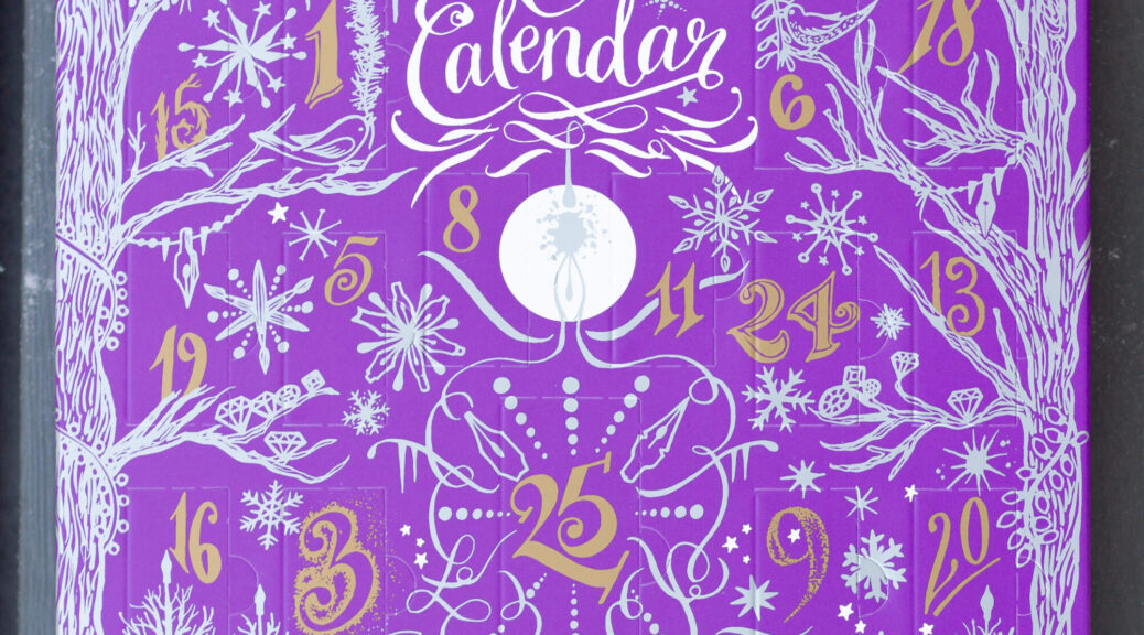
Countdown to Christmas has officially begun! Just like last year—and the year before—I plan to post pictures and brief reviews of each ink from this year’s Inkvent. It’s also a good excuse to open the calendar slightly earlier than December 1st. As in previous years, this year’s advent calendar includes inks from a few different Diamine ink series. The first ink is from their chameleon line, which we first became acquainted with at last year’s Inkvent. They are Diamine’s name…

Read More Read More

Inktrapment – from the archives: Colorverse String and Brane

Inktrapment – from the archives: Colorverse String and Brane

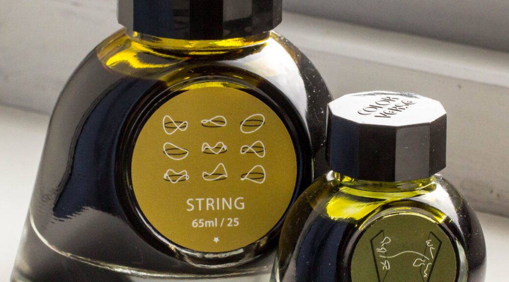
This ink review was the first one I published on this blog (at the time called Fyllepenna) in May 2020. Here is a newly translated version: I’ve long wanted to learn more about ink, and I recently also purchased different notepads to test my inks more thoroughly. More fun in every ink drop! When “Fyllepenna” requested ink reviews, I expressed my interest, and this is my first attempt! I’ve looked at the only two Colorverse inks I have (because you…

Read More Read More

Inktrapment – Robert Oster Maroon 1798

Inktrapment – Robert Oster Maroon 1798

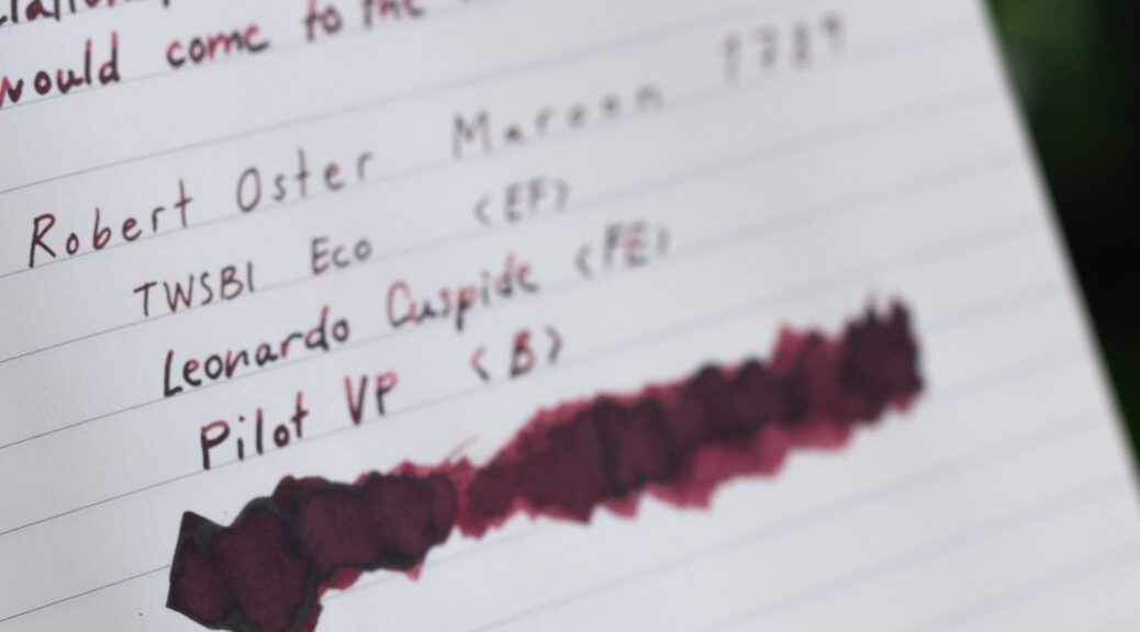
If you, like me, have wondered why this ink is called Maroon 1789 you will find the answer down below. The reason this ink is called “maroon” comes as no surprise. The color is a dark brownish-red — or reddish-brown — i.e. maroon in English. On some types of paper the color leans a bit toward burgundy red. The ink has some nice, not too dramatic shading. On fountain pen-friendly paper it also develops a black halo or a hint…

Read More Read More

Inktrapment – Lamy Petrol

Inktrapment – Lamy Petrol

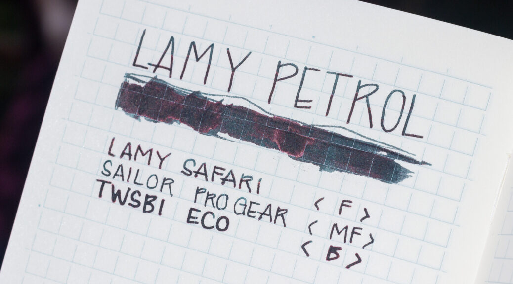
The end of summer, the cusp of autumn. Back to mundane tasks and familiar everyday life. Lamy Petrol is, in my opinion, the perfect everyday ink. Not because it’s boring – it’s not! – but it is convenient and simple to use, can withstand some wear and tear and has just enough distinctiveness and uniqueness not to become bland. The colour is, unsurprisingly, a muted, rather dark teal (i.e., petrol). There is not a lot of colour variations, but still…

Read More Read More